Around 6 years ago I dabbled in digital art and I have improved so much over the years - I can feel and see it! BUT I'm still learning and will forever be finding ways to improve my process to allow me to churn out work quicker without jeopardising the quality of it - which I personally think is an important and useful skill to have in the fast-paced creative industry.
Trying out other people's processes can lead you to finding your own, so I thought I would share my current one (it'll probably change in the future) to help you guys find yours :)
I've included a screenshot of my Photoshop layers so that you all can see how I work. Refer to this when you read through the steps that I'm going to take you through!
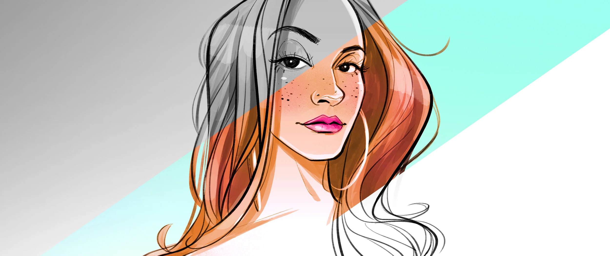
- Preliminary Sketch - Above is a warm up piece I did this morning based on beauty, life and travel blogger, Maria. I always start every piece loose and messy. At this stage, don't worry too much about how accurate your sketch is to your reference - just try to get the general shapes and placement of facial features down.
- Lines / Inks - Once the sketch is done, I make a new layer and clean up the sketch! This time I make more of an effort to capture the likeness of the person I'm drawing. For me, it's useful to draw different parts of the face/head on different layers so that I can easily change and adjust things later on if needed.
- Tonal fills - make a new layer below the inks and using the lasso tool, draw around the outline of your drawing, then use the paint bucket tool to fill it in with white. For this piece I added a subtle grey gradient at the top, where I know the value would be darker. Similar to the previous step, I painted each bits (hair, shadows on face, etc.) on their own layer! Tip: use cmd+G to clip the layer to the one below - this will keep you painting inside the lines/base fill!
4. Adjust values - this step isn't always necessary, but it helps to enhance the values just a tiny bit and will make it pop and read a bit better. Note: all adjustments layers can be found at the bottom of your layers channel.
5. Colour Overlay - Identify the main colour you want to use in your piece and use the Hue/Saturation adjustment layer to colourise your inks and fills. In this case I used orange.
6. Colour Balance - I wanted a more rosey-orange so I used the colour balance adjustment layer to give the orange overlay another colour tint.
7. Layer modes - Here the pink of Maria's lips and blush (and bits in hair) were painted on a separate layer. Turn the mode to 'Colour' and you're ready to roll!
8. Details - shiny hair always look better! Paint with light grey and change layer mode to 'Overlay'.
9. You're almost there - I decided later on that I wanted to use a contrasting colour for the background. Here I simply created a gradient with the colour I want and used a clipping mask to 'remove' the area where the drawing is. Note: yes you can use the eraser tool too but if you use a clipping mask you can always adjust it way easier later on if needed!
10. Final touches - Again, not always necessary, but here I decided to increase the saturation because I like my work colour poppin'!
And there you have it - hope that was somewhat helpful! I'll continue to blog and document changes to my process and any new discoveries on this blog. I think it's quite useful for me too!
'Til next time!